Staring at a long menu and wondering what to order? Here is how to read a restaurant menu: notice where your eye is pulled, question flowery wording, and compare prices without the decoys steering you.
This guide sits within our wider look at how restaurants work, and it focuses on the page in your hands.
| Item | Value |
|---|---|
| Year menu engineering was first introduced | 1982 |
| Suggested maximum options per food category | Seven |
| Sales lift from a photo (one consultant’s claim) | 30 percent |
| Sales lift from longer descriptions (one Cornell study) | Nearly 30 percent |
| Repeat customers’ share of restaurant sales | About 70 percent |
| “Popular” threshold in the original menu engineering model | At least 70 percent of an equal share of the menu mix |
These figures come from Mental Floss’s March 2016 article on menu psychology and Wikipedia’s menu engineering entry. Figures can change, and some are one consultant’s claim, so check the source before you rely on them.
Why a menu is designed, not just written
A menu is rarely a random list of dishes. The March 2016 Mental Floss article says it has likely been tailored by a menu engineer or consultant to be on-brand, easy to read and, most importantly, profitable.
The practice has a name. Menu engineering is the design of a menu to maximize restaurant profits, and the concept was first introduced in 1982 by Michael L. Kasavana and Donald I. Smith.
Restaurants care because the same article reports that repeat customers account for about 70 percent of sales in the industry. A menu that leaves you happy with your choice is part of getting you to come back.
None of this means a menu works against you. Knowing the design simply helps you choose on purpose instead of by default.
How to read a restaurant menu: where your eye goes first
Menu designers think about how you scan a page. Wikipedia describes the “sweet spot” theory: customers remember the first and last things they see, so key items are placed where you look first and last. The same entry adds that there is no empirical evidence on how well sweet spots work, so treat the idea as a rule of thumb.
Consultant Gregg Rapp, quoted by Mental Floss, says the upper right corner is prime real estate and is where the most profitable items usually go. Boxes and blank space do similar work, because negative space around an item can call attention to it.
Length matters too. The same article says seven options per food category is the golden number, tops, because a guest faced with more can become overwhelmed and confused and then default to an item they have had before.
That is useful to know when you freeze at a long menu. If you catch yourself reaching for the usual, ask whether you actually want it or whether the page has simply tired you out.
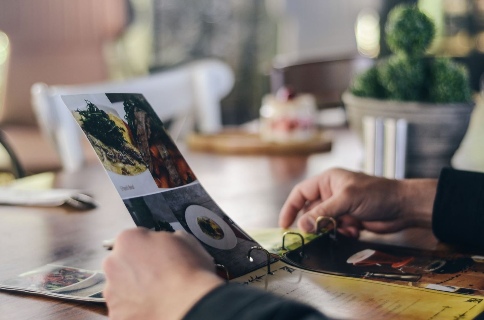
Photos are another visual lever. Rapp claims a nice picture beside an item increases sales by 30 percent. Consultant Aaron Allen, quoted in the same article, counters that crowding in photos lowers how guests judge quality, and most high-end restaurants skip them.
How prices and wording nudge your choice
Prices are often made quiet on purpose. Wikipedia notes that the presence of dollar signs or other monetary cues may cause guests to spend less, which is why you may see a bare number instead of a currency symbol.
Mental Floss also calls dotted lines leading from a dish to its price a cardinal sin of menu design. The reason given is that your eye runs down the price column and starts judging dishes by cost alone.
Then there is the decoy. One trick is to include an incredibly expensive item near the top of the menu, which makes everything else seem reasonably priced.
Price can also change how food tastes to you. In one study cited by Mental Floss, participants were offered an $8 buffet or a $4 buffet. The food was exactly the same, yet the $8 buffet was rated as tastier.
Words work the same way. Mental Floss reports that longer, more detailed descriptions sold nearly 30 percent more in one Cornell study, and Wikipedia says descriptive labeling may lead to higher perceived product value.
Read descriptions for facts rather than mood. A cooking method or an origin tells you something, while a pile of adjectives mostly tells you how the dish wants to be seen.
As of the March 2016 Mental Floss article, many states have “Truth in Menu” laws designed to prevent restaurants from lying about things like how a piece of meat was raised or where it originated. Check the rules where you live before assuming a claim is covered.
What the menu categories mean for you
Behind many menus is a simple scoring model from Kasavana and Smith. It classes each item by popularity (how often it is ordered) and contribution margin (selling price less the item’s food or beverage cost), according to Wikipedia.
The two measures sort dishes into four groups, each with a suggested course of action:
- Stars (popular, high margin) are kept unchanged and given prominent placement.
- Plowhorses (popular, low margin) are kept because guests order them often, then made more profitable through small changes such as portion tweaks or add-ons.
- Puzzles (unpopular, high margin) get better descriptions, a more visible position, promotion or server recommendations.
- Dogs (unpopular, low margin) are candidates for removal.
For you, the takeaway is modest. A dish with a boxed spot, a long description or an enthusiastic server recommendation may be one the restaurant wants to promote, which is not the same as a dish that suits you.
The model also shows why cheap does not mean profitable. In Kasavana’s example, a chicken dish costing $1.00 and selling for $3.00 has a lower food cost percentage than a steak costing $2.50 and selling for $5.00, but the steak earns $2.50 per sale against the chicken’s $2.00.
Labels are relative, too. Wikipedia explains that an item’s classification describes its performance against the other items on the same menu, not against a fixed benchmark. In the original model, an item counts as popular if it sells at least 70 percent of an equal share of the menu mix.
A simple routine for reading any menu
You do not need to memorize any theory. Run through these steps the next time a menu lands on your table:
- Read the whole menu once before you decide, including any boxed or top-right items.
- Ask of each highlighted dish, “Would I pick this if it were plain text in the middle of the page?”
- Compare prices dish to dish, and ignore the single very expensive item that makes the rest look cheap.
- Look for concrete details in descriptions, such as method or origin, and discount the adjectives.
- Ask your server what is popular and why, because Wikipedia notes that many restaurants list daily specials verbally rather than on the page.
If you are reading the menu before you go, remember that a booking carries its own rules, so check the restaurant no-show policy before you confirm. If you would rather read in peace, the best time to book a restaurant is worth a look.
Frequently asked questions
Do photos on a menu mean the food is lower quality?
Show answer
Not necessarily, but Mental Floss quotes consultant Aaron Allen saying that the more items are photographed, the lower the guest’s perception of quality. It also notes that most high-end restaurants avoid photos to keep a perceived level of fanciness.
Why do some menus leave off the dollar sign?
Show answer
Wikipedia says the presence of dollar signs or other monetary cues may cause guests to spend less. Mental Floss quotes Allen saying the signs remind people they are spending money.
Is the most expensive dish the best one?
Show answer
Not by default. An incredibly expensive item near the top can make everything else seem reasonably priced, so it may be there for contrast. Judge each dish on its description and your own taste.
Does the upper right corner of a menu really matter?
Show answer
Rapp says it is prime real estate where the most profitable items usually go. Wikipedia, however, says there is no empirical evidence on how well sweet spots work, so read every section anyway.